Back to projectsCase Study · 2025
Tiger Snack Box · Mobile Game

PACK!

Shaping a playful mobile puzzle game—from market research and product strategy to user flows and developer-ready prototypes.

Product StrategyUX ResearchUI/UX DesignPrototyping
Timeline
3 months
Team
2 designers
Platforms
iOS + Android
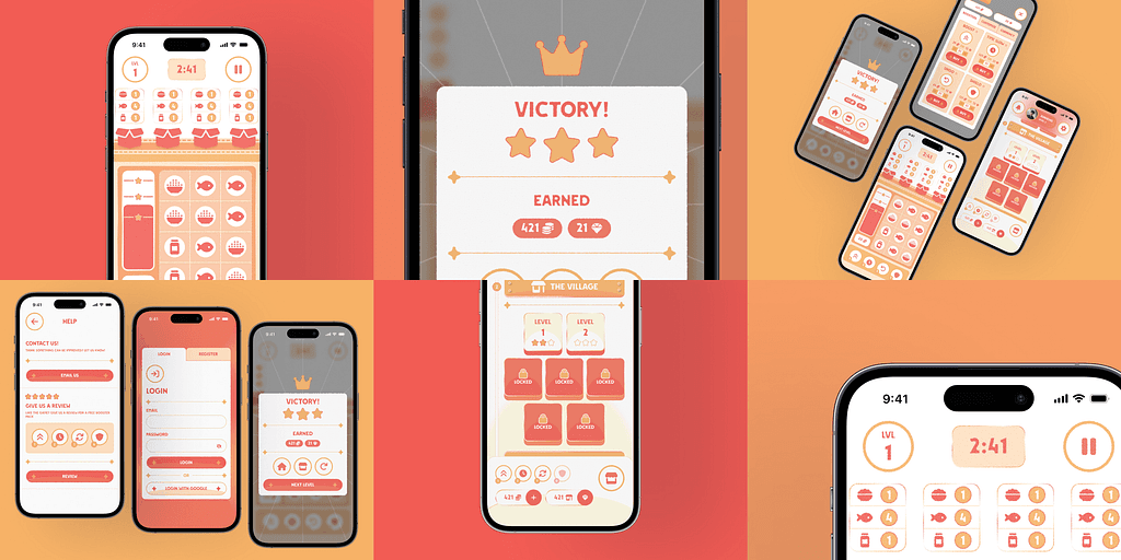
PACK! mobile game overview visual

THE CHALLENGE

Make a new game feel unmistakably like Tiger Snack Box.

Create an engaging puzzle experience that connects the brand with players, while balancing fixed mechanics, business requirements, and a three-month timeline. The design needed to work for casual players with an interest in Asian culture and support both iOS and Android.

HOW I APPROACHED IT

A connected path from insight to handoff

01

Discover

Build a grounded view of the market, players, and constraints.

Compared three puzzle games for interface ideas and mechanics, reviewed the 100 most recent App Store reviews for each, then brought the findings together in a market analysis.

OutputMarket analysis

02

Define

Turn research into a shared audience and product direction.

Turned the research into user personas and a shared product direction: progressive gameplay, a soft visual identity tied to the brand, and monetization that connects in-game rewards with snack-box discounts.

OutputPersonas + answer statement

03

Develop

Validate journeys first, then shape the visual system and prototype.

Mapped the login, tutorial, gameplay, navigation, shop, and settings flows. We tested those journeys in low-fidelity wireframes, then applied the Figma design tokens to high-fidelity screens and interactive prototypes.

OutputFlows + Figma prototypes

04

Deliver

Hand off a connected design foundation for development.

Shared the wireframes and prototypes with developers as the foundation for a playable game, then continued iterating with the team after handoff.

OutputDeveloper-ready design handoff

PROJECT DETAILS

Inside the process

ABOUT

Overview

Tiger Snack Box

Tiger Snack Box is an ecommerce platform focused on delivering international Asian snack boxes to customers worldwide, with popular snacks from Korea, Japan, and China.

Context

The company set out to create a mobile puzzle game to increase brand engagement and customer retention. A co-designer and I were hired to lead the game’s UI/UX design. It was planned for iOS and Android, for casual puzzle players interested in Asian culture.

DISCOVER

Constraints, problem, and competitive analysis

Constraints & guidelines

The shareholder supplied a mobile-only puzzle game with levels of increasing difficulty. It needed to feel cozy and friendly, and generate revenue through paid features, ads, or purchases connected to real-world snack boxes. The visual identity had to reflect Tiger Snack Box’s red, orange, and yellow brand and pay homage to Asian culture. The three-month timeline had a hard deadline so development could begin.

Constraints

Gameplay

The gameplay was given to us by the shareholder: a puzzle game with levels of increasing difficulty. It is a mobile-only experience and needed a cozy, friendly vibe and aesthetic.

Business

The game needed a way to generate revenue, whether through paid features, ads, or purchases through real-world snack boxes.

Aesthetics

The game needed to strongly reflect Tiger Snack Box’s current brand identity (red, orange, yellow) and pay homage to Asian culture.

Time

This was a three-month project with a hard deadline to get development started.

Guidelines

Gameplay

Create a mobile-only experience; keep hand ergonomics and sizing in mind. The game will be touch- and swipe-based.

Business

Revenue would be generated through increased game revenue or increased sales of real-world snack boxes.

Visual design

Create a visual identity that satisfies both the playful feel required and the Tiger Snack Box brand identity.

Time

Separate design into sprints to allow feedback and timely delivery.

Problem statement & success metric

How can we design a mobile puzzle game that engages users and reflects Tiger Snack Box’s brand identity while respecting business requirements, fixed gameplay mechanics, and the three-month deadline?

Success meant delivering a PACK! prototype ready for developers to turn into a playable game.

Market research & competitive analysis

To understand the mobile puzzle market, we compared Puzzles & Dragons for its progressive gameplay and collectible characters, Cats & Soup for its cozy hand-drawn presentation and rewarded-ad model, and Candy Crush for its animations, haptics, and ergonomic interaction patterns.

We reviewed the 100 most recent App Store reviews for each game and aggregated responses into a stat box. The app was the independent variable and review responses were the dependent variable; the source and collection method were controlled by using the same 100 most recent App Store reviews. Since all three games were available on both platforms, platform was not expected to confound the comparison.
Puzzles & Dragons | 4.2/5 Rating

Pros
  • Scenes — Idle scenes play above the puzzle game, making the experience feel like it is constantly flowing.
  • Unique characters — Players love the characters and save currency to roll for them (gacha mechanics), creating a consistent revenue stream without ruining the user experience.
Cons
  • Endgame — The game ends after a certain number of levels; users report that it gets stale when they reach this stage.
  • Co-dependent gameplay — Many levels require cooperation with other players to progress. The number of players who can join is limited by a paywall.

Cats & Soup | 4.8/5 Rating

Pros
  • Charming visuals — Hand-drawn textures with inconsistent strokes and extremely pastel colors make the game very approachable.
  • Lack of pop-up ads — Users like that there are no interruptive ads and that the game uses rewarded ads for revenue.
  • Environment — Users like leaving the game open and playing in their free time because of its calming, cozy nature.
Cons
  • Cluttered UI — The game has many UI elements that can be overwhelming for some users.
  • Repetitive gameplay — The game stays at a consistent difficulty level, and users say they get bored quickly.
  • Misclicks — Users report misclicks that lead to accidental purchases and actions they did not intend.

Candy Crush | 4.7/5 Rating

Pros
  • Animations & haptic feedback — Animations and haptics make the game feel more engaging and interactive.
  • Ergonomic design — The game is designed to be easy to use and navigate, with a focus on hand ergonomics and sizing.
Cons
  • Interstitial ads — Users report that interruptive ads make the game unenjoyable and sometimes unplayable.
  • Pay to win — Many users report that later levels become extremely difficult and require paid boosters to progress.

DEFINE

From findings to answer statement

Market analysis

The review data showed what players valued and where friction appeared: the cozy, illustrative style of Cats & Soup, reduced frustration when monetization stays optional, and progressive mechanics that continue to evolve.

78%

Loved the illustrative and cozy feel of Cats & Soup.

40%

Heavily disliked the interstitial ads in Candy Crush.

36%

Heavily disliked Candy Crush’s pay-to-win mechanics that stopped progress at harder levels.

34%

Loved the progressive and constantly updating gameplay mechanics in Puzzles & Dragons.

Design recommendations

We translated those findings into four directions for PACK!: preserve a cozy, approachable look; choose rewarded ads rather than interruptive interstitials; connect in-game rewards with real-world snack-box coupons; and make progression engaging by evolving difficulty and mechanics over time.

Use hand-drawn textures and pastel colors

Users preferred hand-drawn textures and pastel colors because they feel more approachable and engaging than other colors.

Stay away from interstitial ads; use rewarded ads instead

Users preferred rewarded ads because they are less intrusive and more engaging than interstitial ads.

Rewards, in-app purchases, and coupons for real-world snack boxes

Offer in-game customization, purchases for currency and gems, and challenges that give discounts on real-world snack boxes.

Progressive gameplay mechanics

Increase difficulty as users progress by making the game faster, increasing penalties, and manipulating game mechanics in interesting ways over time.

User personas

We used four personas to turn the research themes into recognizable player needs.

SC

Sarah Chen

Age 16 · Female

Sarah loves cozy idle games like Cats & Soup. She prefers hand-drawn visuals and soft colors, and often keeps games open while listening to music. She avoids intrusive ads and gets attached to charming characters or collectibles.

SJ

Steven Jackson

Age 17 · Male

Steven plays games like Candy Crush and Puzzles & Dragons to challenge himself. He enjoys games that reward skill and persistence, but dislikes difficulty spikes or monetization that blocks progress.

JS

James Smith

Age 20 · Male

James values visually minimal, intuitive games that don’t demand constant attention. He enjoys background play loops and appreciates rewarded ads when they feel optional and balanced.

EJ

Emily Johnson

Age 18 · Female

Emily gravitates toward games with a strong visual identity and personality. She enjoys discovering how design connects to brand storytelling.

Answer statement

We can create an effective mobile puzzle game by engaging users through progressive play with the given mechanics; building a soft, pastel visual identity from colors, textures, and design tokens that still reflects the brand; and supporting app revenue and real-world snack-box sales through rewarded ads, in-app purchases, and discount challenges.

DEVELOP

Flows, wireframes, and visual system

User flows

Before designing screens, we mapped the user’s journey through login, tutorial, gameplay, app navigation, shop, and settings. Registration was also part of the broader flow work. Mapping the journeys first helped us understand how the screens connected.

Low-fidelity wireframes

With the user flows established, we created low-fidelity wireframes to test whether the journeys were valid. We explored different screen variations and focused on understanding the app’s structure before adding visual polish.

Design tokens

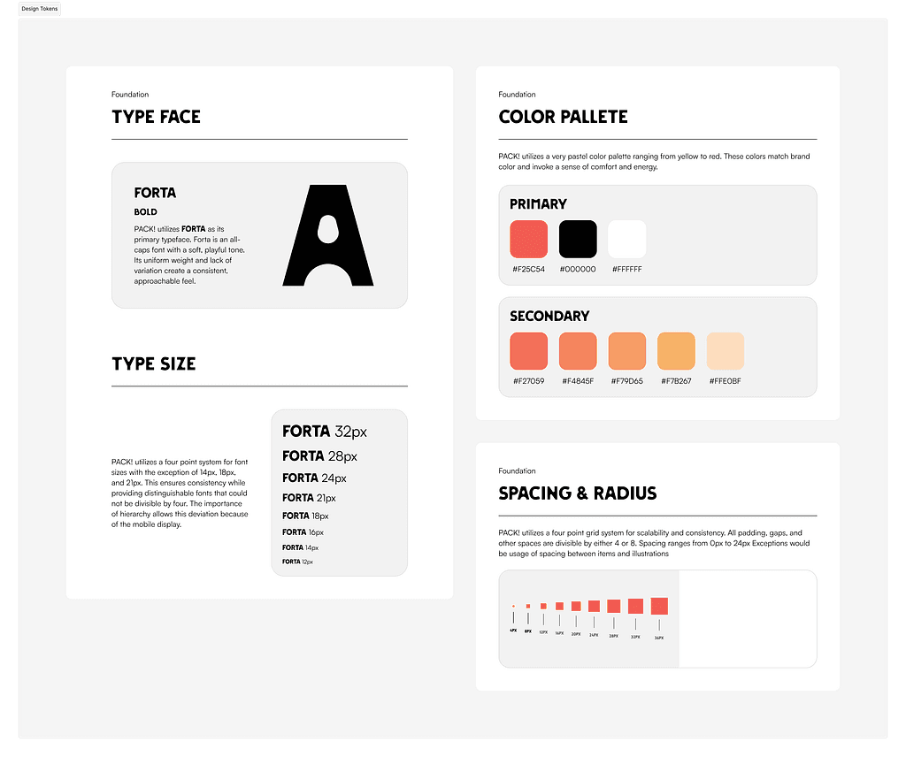
Once flows and low-fidelity wireframes were in place, we moved into Figma. The token board brought together the typeface, mobile type scale, brand palette, and four-point spacing system.

Original PACK! design-token board showing the Forta typeface and type scale, primary and secondary color palette, and four-point spacing system
Original Figma design-token board: FORTA typography, brand colors, and the four-point spacing system.

High-fidelity wireframes & visual language

After defining the design tokens, we applied them to high-fidelity wireframes. Texture, noise, and gradient strokes helped create an illustrative, hand-drawn feel.

User-flow prototypes

With the high-fidelity wireframes finished, we returned to the user flows and created Figma prototypes for each flow, connecting the screens into experiences that could be reviewed and handed off.

DELIVER

Final preview & developer handoff

Final preview

The final preview showcases the app’s visual design, gameplay mechanics, and user experience. We handed off both wireframes and prototypes to the development team to begin building a playable game.

INSIGHTS

What now?

An ongoing product collaboration

PACK! is not a finished game. We continue working with the developers and iterating through the design process toward a more complete version of the game.